Showing posts with label War. Show all posts

2.08.2009

Fun Stuff from Rod Espinosa

Somehow or another Antarctic Press has managed to exist as a comic company for a quarter of a century without my ever really having taken notice of them before. Well okay, I did pick up an issue or two of Warrior Nun Areala back in the day-- I had to know what that was all about. But for the most part I haven't really paid much attention-- I've never gotten way into manga, so American manga sounded like an even iffier proposition. In a way though, Antarctic's output could be seen as more accessible than traditional manga: they're released in American comic-sized bites, they read front to back, they're in color. They're an interesting alternative for U.S. readers who don't get manga.

Filipino-born Rod Espinosa is not only Antarctic's VP of Production, but also one of the more prolific creators producing for the company. As far as I can tell from the credits, Espinosa does it all: writing, penciling, coloring, he might even letter his stuff as there is no separate letter credited. Scanning the shelves for outer spacey goodies to review, I ended up with not one but two recent Rod Espinosa graphic novel releases: the first volumes of Prince of Heroes and Dinowars, two books laden with fantastic imagery, imagination and fun exciting action.

Prince of Heroes is a coming of age tale told over a space opera backdrop. The young protagonist Ronen Ladarna has grown up in humble surroundings, but was born into a powerful clan and has a greater destiny. What's a bit unorthodox about the setup is that Ronen is already aware of this at the beginning of the comic. Usually in these kind of tales the hero is unaware of the secrets of his past and he and the reader become aware of things together as the story progresses. But in Prince of Heroes everyone in the story knows what's going on well before the reader does; some key information isn't really explained until halfway or even three-quarters of the way through the book. Only towards the end do you start to get the picture of what really should have been explained in the early pages.

For thousands of years, the galaxy has been under the dominion of the powerful elitist clans of the Greater Darem Empire. Ronen was born into one such clan, but for unrevealed reasons his mother Aiymie took him away to live an obscure childhood on a frontier world. Now that she has decided that Ronen is old enough to be introduced to his father and formally claim his rightful place, the two of them have been slowly making their way back to the core-- moving as far as their finances will get them and then stopping to earn more and get them further along.

Ronen has grown so fond of living the life of a simple farmer on their latest world of Irdne, that he isn't really sure that he cares about his lineage. He counts many locals among his close friends, including a martial arts master named Ze, wheelchair-bound and blind but still commanding great respect, and his wards Tenny and Zeb, who are like younger siblings to Ronen. He and his mother also have three fuzzy family servants who are as skilled in battle as they are in farming. Ronen identifies so strongly with the locals that he stands against fellow Darems of the Mesozora clan who arrogantly throw their weight around and terrorize the local populace. Because of the increased size and strength of Darems, this leads to an epic-scale hyperbolic martial arts battle that takes up a goodly chunk of the first book.

If you like space opera as much as I do, this is a intriguing beginning to what could develop into an great saga. Ronen's life is thrown into chaos when open rebellion on the frontier causes the withdrawal of Darem colonists in the face of local violent uprisings. One young man caught up in the great historical events of his time is the stuff of legends, and by the close of the first volume Espinosa had me ready and eager for the next installment.

On the other hand, if big epic space opera is not really your thing, hows about rampaging cyborg dinosaurs stomping across the Earth and trying to wipe out humanity? That's the premise of Dinowars, Espinosa's other recent graphic novel release. It's a bit light and not particularly sophisticated, but as a quick fun read of armies battling dinosaurs, it does its job.

Here's the high concept: millions of years ago, dinosaurs evolved into sentient tool-users known as Triassians. The reason humanity has remained ignorant of this development is that when warned of the imminent approach of a deadly ice age, these intelligent saurians built spacefaring craft and left the Earth. After eons spent floating around the asteroid belt in hibernation, this advanced civilization rains down from the sky, and they want their homeworld back! One faction, called the Protosaurs, are willing to negotiate, but the more murderous Megasaurs see humanity as a pestilence to be wiped out. Two human heroes are at the center of the action as it unfolds.

Commander Hank Armstrong is the kind of square-jawed all-purpose military hero that you can only find in comics. When we first meet him, he is the first astronaut to set foot on the moon in forty years. When they uncover cybernetically enhanced dinosaurs on the surface, he barely makes it back to his shuttle. Upon his return to Earth, Armstrong picks up a machine gun and is suddenly leading ground forces against the invaders. Why army personnel would gamely take orders from a passing astronaut is beyond me. At the climax, he hops aboard a prototype bomber with a mystery weapon, and sudden he's a jet pilot. He's such a mack daddy that when he flies into combat for the final battle, he has a hot babe strapped to his lap the whole time!

The babe in question would be Debra MacDonald, a small-town waitress from Nowhere, Texas. Her dead-end life takes a sharp turn when Protosaur emissaries crash land on her family farm, and soon mindlink with her so that she can be their interpreter. Before long, this humble server is addressing the United Nations with the Protosaurs' wishes to populate Antarctica. And wouldn't you know it, when Debra and Hank cross paths, it turns out that they were high school sweethearts who broke up at the prom! What are the odds?

Espinosa's greatest strength is his artwork, which yes is manga-inspired but is more lovingly-wrought and detail-oriented than a lot of stuff I see coming out of Japan when I'm at the bookstore skimming. He has a great design sense, whether he is conjuring up cyber-saurs, extraterrestrial beings, starships or alien artifacts, it all looks great. He's equally adept at cute heroines or state-of-the-art military hardware. Espinosa also clearly makes use of computer rendering for a lot of his designs, which is sort of a double-edged sword. On the one hand, it allows him the ability to create meticulous highly detailed cityscapes which border on breathtaking. However, the digital and line art doesn't meld together as well as it might: buildings all look too pristine, too symmetrical. If Espinosa can figure out a way to give his CGI work a worn look and make it blend better, it would look way better. Espinosa also has a tongue-in-cheek cheesecake element to his female characters which I find fun but may exasperate others. Female characters tend to get their clothes shredded and the woman who faces Ronen in combat ends up face-down, ass in the air in a blatantly submissive position more than once.

Bottom line, both of these books are capital-F Fun. The Dinowars pocket digest has a prominent "1" displayed on the cover and spine, but frankly the book has enough closure to satisfy me, and I don't think there's enough going on there to make me want to come back for a second round. It was enjoyable enough, but Prince of Heroes is the story I'm eager to see more of. Ronen's story is just beginning, he's only just headed into space and his destiny as the first volume comes to a close. Now's the time to jump aboard and see where the story is headed. Espinosa has helpfully posted the first volume online, which seems like an odd strategy while trying to sell a book of the same material, but at least readers can judge whether they want to preorder Prince of Heroes Volume 2, the first issue of which is being solicited this month. I'm on board.

Dinowars Rating: 7/10
Prince of Heroes Rating: 7.5/10

1.26.2009

Terminator vs. Terminator

In the past few weeks, two different Terminator #1’s have hit the streets, not surprising as anticipation for the fourth film grows as we get closer to its May 22nd release. What’s strange about it, though, is that these comics are coming from two different companies, one from Dynamite and the other from IDW. It boggles my mind that competitors can both possess the rights to produce comics from a popular franchise at the same time, but since this unique situation has arisen, the only logical thing to do is to seal these 2 books up in a mylar bag and have them go at it, robo y robo, until one book emerges victorious.

It’s Terminator fight night!

Ladieeeees and Gentlemen, in this corner, weighing in at $3.50 for 22 pages of story, is Terminator: Revolution #1 by Simon Furman and Lui Antonio.

Annnnd in this corner, weighing in at $3.99 for 22 pages of story, is Terminator: Salvation #1 from Dara Naraghi and Alan
Robinson.

Okay let’s have a dirty filthy fight, no holds barred annnnnnd…
Fight! Fight! Fight!

Round One: The Introduction

Revolution: This may be a first issue, but we learn from the recap page that this mini continues on from at least one previous series. "Kate Bewster" has died a year previous and John Connor received help from a terminator called "Uncle Bob" in fleeing Crystal Peak, whatever that is. By the way, isn't Kate's name "Brewster"? Nice copyediting. Also, according to the IMDB, Kate is alive and well in film 4, which means these comics represent yet another alternate version of the Terminator storyline, separate from both the movies and the TV show (which already conflict with each other).

Salvation: Billed as an official movie preview, this comic flows directly from the events of Rise of the Machines. As long as you've seen the three movies, or even just the last one, you're golden.

Winner: Salvation.

Round Two: The Setting

Revolution: A bunker in New Jersey, plus the blasted environs of its perimeter. Also, in the past, a trailer in 1996 New Orleans.

Salvation: Opens with a globe-spanning montage as John Connor sends out a message of hope and resistance to the remains of humanity. Shots of the Capitol, Forbidden City and Taj Mahal (among others) in smoking ruins bring home how much civilization has lost under the reign of Skynet. The action of the story unfolds on two fronts, a resistance HQ in Detroit and a refugee camp in Arut, Niger. In just a few pages this book does a much better job in establishing just how far the nations of the world have fallen.

Winner: Salvation

Round Three: The Characters

Revolution: John Connor and his new wife Tara are the center of attention, which a short appearance by a young Kyle Reese. The rest of the freedom fighters are basically just cannon fodder. In the past, we're back with Sarah Connor (looking nothing like Linda Hamilton) and young whiny John.

Salvation: With John relegated to a voice on the radio and a brief flashback scene, the main characters here are from a range of ethnicities and cultures, united as one against the common aggressor, the machines. The resistance here come off as real people, not a bunch of rednecks in camoflage.

Winner: Salvation.

Round Four: The Action

Revolution: While waiting to kick his latest operation into gear, an attempt to wrest control of a missile command center from Skynet, John Connor sits around his bunker being anxious and fretting about when Terminators are going to try and come wipe out his new wife. And then one does, in the form of the highly advanced T-Infinity model. Meanwhile, in 1996-- well you know the score: Sarah and John are on the run, and Terminators are trying to kill them. Rather than just one, Skynet has sent 8 of them after the Connors this time.

Salvation: Similarly, a plan is afoot to thwart a Skynet uranium mine, but meantime Resistance leader Elena Maric tries to convince an underground survivalist community to stop hiding and take a stand against the enemy. Both Detroit and Arut come under assault by robotic forces.

Winner: It's a draw; both have a healthy dose of gunfire and explosions.

Round Five: The Artwork

Revolution: This is where this book really falls down: in Antonio's vision of the post-apocalypse, everyone is pretty and buff and runs around in tank tops to show off their physiques. Tara Connor is supposed to be a respected resistance leader, yet she runs around with her big boobs barely restrained by her skimpy top and thong straps showing out of her pants. Cause, you know, when you are fighting a losing battle to save humanity from extinction, you wouldn't want your panty lines to show through your cargo pants! Also the T-Infinity looks mighty super-heroey for the dystopian setting, he kinda resembles Mr. Freeze's long lost brother.

Salvation: Robinson's pencils are much more appropriate for the milieu in which the story is taking place. Far from being glamorous and beautiful, the characters have... well, character. They come in different shapes and sizes, look frazzled and dress more in keeping with desperate freedom fighters eking out an existence in a ruined world. The depiction of the shattered world monuments in the opening pages alone are more interesting than anything in Revolution.

Winner: Salvation.

And by the unanimous verdict of the judges, the winner and champion is:

IDW's Terminator: Salvation #1 for sure. Revolution is just a very by-the-numbers story with little to set it apart from other Terminator stories, drawn too bright and superheroish. Salvation does a much better job of reflecting the saga as a worldwide event, with dark atmospheric artwork and interesting characters to become invested in. Presumably Naraghi and Robinson were able to get a look at script and artwork from the upcoming film; this comic makes me look forward to its imminent release that much more.

Revolution rating: 6/10
Salvation Rating: 8/10

1.20.2009

Shrapnel: Aristeia Rising #1

Boy, I've been looking forward to Shrapnel since Radical Comics released that cool, intriguing trailer a few months back. Okay, it looked a bit like a video game, but heavy metal mecha warfare, who can't get into that? In the intervening time, Radical has been promoting the heck out of it, sitting down for interviews with any site that'll have 'em. Hand it to these guys, they know how to market. Then you see the issue in question, a nice hefty size at 48 glossy pages for a stunning $1.99 cover price. How can you go wrong?

Well the short answer is: by having an uninspiring story and lousy art.

The issue opens with a military action that is depicted with such dark and murky art that it's hard to tell what the hell is going on. I certainly can't make out who is fighting whom, or who's winning. It's just flashes of armored soldiers, mechas and big guns and a lot of swirling flame. After 10 pages of this chaos, we find out that it isn't even a real battle we've been watching, but a virtual reality training exercise! Ultimately, we will realize that the marines training here aren't even the main characters of the story. In fact, they are invading world after world and crushing local resistance; in essence these are the bad guys. Why we want to watch generic hostile grunts practice fighting is beyond me.

Let me say up front, Bagus Homoto's paintwork is not to my taste at all. Pretty much the entire book is as dark and impenetrable as the opening. Even for scenes taking place in broad daylight, everyone is clouded in shadows and murk. Considering that faces don't look so swift even when we get a good look, maybe that's on purpose. Sometimes you have to take a hint from where the word balloons are pointing to figure out who's even speaking. It's a shame, the art has been so strong on previous Radical books that this is a huge letdown for me.

A quarter of the way into the book we are finally introduced to the protagonists, a trio of Venusian miners called Sam, Stap and Jammer. It's a somewhat trite scene in which the volatile Stap gets into a barroom brawl with a group of artificially-enhanced "Genotypes," as they argue back and forth whether naturally-born "helots" like Stap deserve equal treatment. It's exposition by insult, with lines like: "I'll break it down pre-school so you can understand-- we're smarter than you and that's why we run the system" or "Helots are just as good a human as any splicer. So I can't figure out pi to the last digit in my head, or run as fast as you, but at least I have some fricking manners!" Not sure I buy that anyone ever talks like that, but as least writer M. Zachary Sherman was able to set up the Genotype/Helot dichotomy for us.

By the end of the issue, I'm not sure how this class warfare even fits in. The main plot concerns the approaching invasion force of the Alliance, who have demanded the surrender of the local government of Venus. World by world, the Alliance has been assimilating the free colonies through brute force, and now have given the President of Venus 24 hours to surrender. Although the planet has no standing army, local genotypes and helots have just as much to lose if they don't volunteer to join the local militia to take a stand against the overwhelming numbers of space marines. Stap and Jammer answer the call, but Sam tries to talk some sense into them, failing to persuade them that they are going to die for a lost cause.

Sam is the female character depicted on the various covers for this series (don't ask me who or what "Aristeia" is; unless I missed a reference, the word isn't even mentioned), and really the only character who is given much depth in issue one. She's quiet, reflective and no-nonsense, and obviously there are some important events in her past which define who she is now. There's certainly some reason why she spends her off hours arguing with a psychological AI program versed in post-traumatic stress disorder, which she has elected to manifest as a hologram of her deceased little sister. When Stap accidentally begins floating off into space during a mining mishap, she reacts with much more command and unconscious training than a simple miner would be expected to have. The issue ends with her planning to flee in the face of the coming storm, but considering that she's wielding weaponry on the battlefield on most of the covers, one would assume that a change of heart is coming up.

Mark Long and Nick Sagan are credited as the co-creators of this book, but I'm not sure what that really means since neither of them wrote or drew it. Sherman uses some weird pacing and clunky dialogue, requiring characters to regurgitate information that the listener would already know, in order to explain the scenario to the reader. The characters other than Sam are pretty thin, and don't ask me why we spend so much time with the Alliance marines, unless the intention is to make some of them sympathetic in future issues, and not the steel-booted thugs everyone believes them to be. The art is just a mess, way too impressionistic and unappealing through most of the book. Honestly, any one of the many cover artists working on this series would be a better choice for the interiors. Radical, I still love you guys, but I think I'm gonna give this series a pass.

Rating: 6.5/10

9.21.2008

Titanium Rain #1

It took me a moment to remember why I preordered Titanium Rain in the first place. At first glance, it appears to be a straight up war comic with no particular science fictional angle. Not that I don’t enjoy a good war comic, but I recalled ordering it with a view towards reviewing it for this site. Then, upon further examination, I noticed a 4-panel appearance by a mecha in the opening fight scene, and also that the supplementary maps are dated 2031. Those are your only indications that the story doesn’t take place today.

The aforementioned battle, by the way, comprises the first five pages of the issue, and is the only actual combat that takes place in this ostensible war comic. U.S. soldiers are in enemy territory and under fire, in the midst of a massive Chinese civil war. The scene is compelling and well-rendered, but it’s over in a blink. Frustratingly, once we turn away from this locale we never return to it and none of the characters appear again or are even mentioned for the remainder of the issue.

Instead, the scene switches to an air base off of mainland China, where a squad of pilots spend the bulk of the issue playing poker. My mind boggled at how long this scene drags on, as the squad captain attempts some convoluted metaphor as to how poker is a reflection of the ongoing conflict. I suppose writer Josh Finney is trying to figure out a way to squeeze in an explanation of who is fighting who and why, but this scene of talking heads sitting around a table goes on for what seems like an eternity (it’s actually 9 pages of a 23 page story) and by the end I was still at a loss as to the point Captain Schilling was trying to make.

The photo-realistic artwork in this comic is far more interesting than the writing. The faces of the characters are so unique and distinct that Kat Rocha clearly used real-life models for everyone, of which I approve. Many comic artists seem unable to draw different character faces, to the point where the only way to tell them apart in some books is by their hair styles and clothing. In this comic, it’s very easy to differentiate all of the characters-- even thought all they do is sit around B.S.ing for most of the comic.

Finally towards the end of this issue the pilots are called to arms and hop in their planes. Clearly something exciting may occur-- next issue!

I was both surprised and a little frustrated when I learned that the descriptive blurb on the back cover of this issue reveals more about what’s going on in this comic than the actual comic. According to the synopsis “civil war in China spirals into world conflict. Nations are destroyed. Millions are killed.” It does? They are? Although it’s obvious there’s fighting going on in China, nothing in the actual issue indicates that there is this level of carnage and devastation going on worldwide. “And for many, like US Air Force pilot Alec Killian…” What? Killian is meant to be this story’s protagonist? Who knew? The pontificating captain gets most of the speaking time in this issue. “…survival will mean shedding some of his humanity in exchange for biotech and machine.” It will? That sounds pretty cool, what issue will that be in?

Based on the premise and the artwork, Titanium Rain would seem to have potential, but the pacing is bad and the captions and dialogue vacillate between pretentious and corny. I’d rate Titanium Rain #1 a 6, at best. It’s possible that the whole poker thing would read better and not seem so interminable in a collected trade paperback, but to make it the focal point of a single comic, and your premiere issue no less, was a horrible decision and a big let down. Tighten up those scripts, Mr. Finney!

9.05.2008

Heavy Metal Overload Special Summer 2008

To this day, the name Heavy Metal puts a little song in my geeky heart. This despite the fact that, in actuality, I’ve read proportionately very little of its impressive 30-year run. I suppose a lot of the warm fuzzy glow I get from the brand comes from the daring 1981 animated extravaganza, which hit HBO around the time I was 12 and pretty much blew my hormonally-ravaged young mind. I was just the perfect age for its bizarre blend of juvenile and adult, fantastic and uncouth.

Flash forward ten years. I have disposable income and no longer fear parental units stumbling across my weird nudie space comics and demanding an explantation. So I signed up for a 3-year subscription to Heavy Metal and gleefully rubbed my hands together in anticipation of the delights to follow.

The verdict: a mixed bag. Somehow, the magazine didn’t entirely live up to my idea of what it would be. Maybe it was because the days of Moebius and Bode were well in the rearview mirror. The original owner had sold the magazine to Peter Eastman- co-creator of Teenage Mutant Ninja Turtles- who seemed to see it primarily as a vehicle to promote the career of Julie Strain, a D-list actress with ginormous fake boobs who happens to be Eastman’s wife. Maybe I was misled by the quality of the film into thinking Heavy Metal was something it wasn’t. All I know is the ratio of stories I enjoyed to those I didn’t was about 1:5.

There were things that irritated me. For example, there were some ongoing series that others readers (or at least the editors) enjoyed way more than I did. It seemed like every 4 or 5 months there was a new installment of certain stories that I didn’t want to read in the first place. Other times, they would print the first part of a story and never print the rest. They also started reprinting a lot of old Atomika and Tundra material, which pissed me off because I had already bought it the first time! I was also aggravated with the magazine’s policy of publishing seasonal special editions which weren’t considered part of the subscription. Even though I had signed up to have the magazine delivered to my doorstep, there were issues on the stands that I wasn’t getting. Like I said, irritating.

Once my subscription ran out, I cut ties with Heavy Metal and haven’t bought a copy in the intervening 12 or so years. I would flip through it from time to time on the stands, but the Summer 2008 special caught my eye in a way that no other issue had for quite some time: some fantastic artwork…a sexy lady…WWI soldiers in combat…a half-man half-robot and a mad scientist type in his spooky lab. They got me. I plunked down my seven bucks figuring, “even if it ends up sucking I can rip it apart on my blog.”

The issue’s first story is a quick 7-pager called “The Door” by JM Darlot and IG Holgado. It concerns an ordinary-seeming desk jockey whose day at the office is suddenly interrupted by the arrival of a new door which he did not order. No sooner have the delivery men propped up the mysterious door and departed then a knocking begins to sound from the other side- even though there is no other side! I’ve never been a big fan of the short form and nothing here changes that opinion. “The Door” is more about setting a mood than telling a story, and it’s only partially successful at doing that. Holgado’s clean artwork is almost Disneyesque, which is a look I enjoy sometimes but isn’t quite dark enough for the creepy tone Darlot’s going for here. An intriguing premise to a better story than anything satisfying unto itself.

The title character of Massimo Visavi and Adriano de Vincentiis’ “Sophia” provides the issue’s requisite T&A. De Vincentiis’ art is very good, he is as adept at drawing beautiful villas or the canals of Venice as he is the curves of a nude woman. So at least there is something nice to look at while you are plowing through an otherwise underwhelming supernaturally-tinged quest around the globe. Along the way we are subjected to some pretty awkward dialogue, although whether that can be chalked up to bad writing on Visavi’s part or a poor translation I couldn’t say.

Sophia Delamore is the scion of the very powerful but extremely dysfunctional dynasty. Her father went insane, and tried to murder her as a baby. Her mother had no choice but to kill him to save Sophia, but she in turn was killed by the vengeful grandfather. The evil grandfather is dead now as well, but his estate is in limbo because no one can locate his will, which has been locked away in a small carved chest behind a mysterious symbol. Sophia’s people track down the box, but before she can even figure out how to open it it’s stolen again. So she criss-crosses the world to once again gain possession of the heirloom. Imagine a watered-down cross between the Da Vinci Code and Raiders of the Lost Ark, only with Paris Hilton as the heroine.

And that was the biggest of the story’s several problems. Sophia is a rich, haughty celebrity who is too dumb to know that baby tank tops and high-heeled boots are impractical attire for slogging though a South American jungle (this can’t be chalked up to artistic license, by the way, even other characters point out how ludicrously she dresses). Visavi tries with mixed results to make her more sympathetic through flashbacks of her as a young girl being haunted by her mother’s ghost and being abused by an evil nun. It all leads up to a whopper of a revelation at the end, and the realization that, regardless of the “The End” on the last page, this is really only the first chapter of an ongoing saga. I can only wonder when another chapter might appear, and whether anyone will care when it does.

If I thought the translation in “Sophia” was sloppy, it’s ten times worse in the next story, a noir-looking boxing story called “Man at the Carpet.” Actually, the translation is so egregious the only way I can tell what the story is supposed to be is by looking at the sketchy Ted McKeever-esque artwork. The captions are really that indecipherable!

Example the first, our narrator Joe describing how an opponent’s punch feels like being hit by a train: “…it seemed to me the most logical explanation, to strike me had to have been for strength a commodities train and not the red boxing glove of Tyler Holland, my challenger.” Flows nicely, doesn’t it?

Someone urges Joe to get an honest job and avoid criminal types: “Think to stay up, pal… you are young. One like you finds a good job to the docks. Don’t fall out with that people!” Wha…huh?

An aforementioned criminal type tries to convince him of…something… “It’s not good enough to be good to arrive at the top… It always needs the help of someone, There is who looks for it, and who, like you, receives that help without know it.” Words to live by, my friend, words to live by.

The whole story is this puzzling. I’m not sure what’s more appalling, that someone did such a horrific job of English translation, or that said translation crossed some editor’s desk who responded, “Looks great-- print it!” Everyone involved with the magazine should be embarrassed that this thing ever saw print like this.

The story that redeems the whole issue is Xavier Dorison and Enrique Breccia’s fantastic “The Sentries”, a bleak cyber-monster story set in the opening of World War I (would that make it--- “Greatwarpunk”?) Based on the eye-popping artwork alone I was convinced to buy this special, and there are visual treats to pour over on every page. Breccia’s actually a world famous artist, but I’ve been ignorant of his work up until now. This page is from the original French version, but check the pencils:


The script is equally compelling, telling the tale of a tortured soul whose good intentions lead to nothing but misery. Gabriel Feraud is a scientist who has invented a radium-powered battery, but despite his family’s near-destitution refuses to sell the design to the military for use in the impending war. Colonel Alphonse Mirreau is in charge of Project Sentries, a research experiment to create cyborg soldiers for the French army. Previous attempts have failed because the cyborgs didn’t have sufficient power and ran down on the battlefield. Now Mirreau will utilize all the pressure his rank provides to strongarm Feraud into handing over his battery design. What follows is a test of wills as Feraud tries to uphold his principles. But as often happens when a lone citizen tries to stand up to will of the institution, his struggles may ultimately prove the downfall of his entire family.
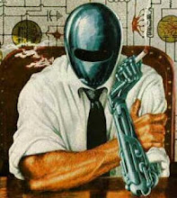

Breaking down the issue by rating:
"The Door" (7 pages): 7
"Sophia" (54 pages): 5.5
"Man at the Carpet" (10 pages): Incomplete!?
"The Sentries" (62 pages): 9


At first blush, it might not seem worth picking up the Overload special just for one story, but because "The Sentires" is so good, and because it is so long, it just about justifies the $6.95 price tag on its own. Monthly comics are about three bucks for 22 pages, so the price actually compares favorably. I say grab a copy, and if you happen to like some of the other stories too, even better!